Hey there! You might’ve noticed that I use a different kind of font to many other fonts used online. I use a dyslexia-friendly fonts, listed as Open Dyslexic. Why?
First off, dyslexia is something that affects how people read and process words. It’s a facet of neurodivergence that makes traditional fonts a bit of a headache to read. So, imagine trying to reach out for help when the very words you’re reading are causing you stress. My practice is driven by creating spaces to be accessible – and so my advertisements are designed to be.
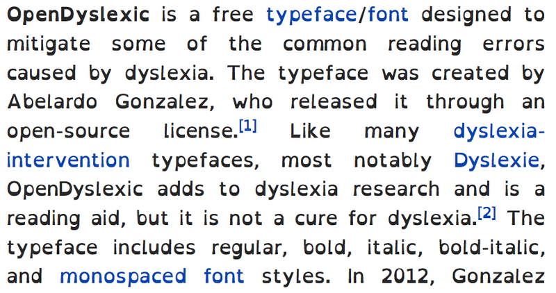
That’s where dyslexia-friendly fonts come in. They’re designed with readability in mind, making it easier for folks with dyslexia to navigate through text without feeling like they’re decoding a secret message.
But it’s not just about making things easier to read. It’s about making everyone feel welcome. Using dyslexia friendly fonts when possible is about my focus on fostering inclusivity and creating a space where everyone feels comfortable reaching out for support.
When you know that someone has taken the time to consider your needs, it helps you to feel heard and understood. And that’s exactly the vibe I’m going for. It’s one of the most commented-on parts of my posts.

By using dyslexia-friendly fonts in my ads, I’m shining a light on dyslexia and other learning differences. It’s a little nod to say, “Hey, let’s talk about this. Let’s make the world a bit easier to navigate for everyone.”
So, there you have it. My use of dyslexia-friendly fonts isn’t just about aesthetics – it’s about making a difference, one post at a time.
I’m trying to find ways to make open-dyslexic work on WordPress!
